Welcome to this week’s Math Munch!
Behold the Sphericon!
What is that? Well, it rolls like a sphere, but is made of two cones attached with a twist– hence, the spheri-con! The one in the video is made out of pie (not sure why…), but you can make sphericons out of all kinds of materials.
 It was developed by a few people at different times– like many brilliant new objects. But it entered the world of math when mathematician Ian Stewart wrote about it in his column in Scientific American. The wooden sphericon was made by Steve Mathias, an engineer from Sacramento, California, who read Ian’s article and thought sphericons would be fun to make. To learn more about how Steve made those beautiful wooden sphericons, check out his site!
Even if you’re not a woodworker, like Steve, you can still make your own sphericon. You can start with two cones and make one this way, by attaching the cones at their bases, slicing the whole thing in half, rotating one of the halves 90 degrees, and attaching again: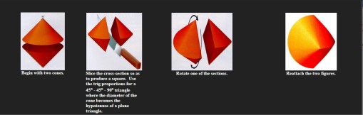
Or you can print out this image, cut it out, fold it up, and glue (click on the image for a larger printable size):

If you do make your own sphericon (which I recommend, because they’re really cool), watch the path it makes as it rolls. See how it wiggles? What shape do you think the path is?
 I found out about the sphericon while browsing through an awesome website– the National Curve Bank. It’s just what it sounds like– an online bank full of curves! You can even make a deposit– though, unlike a real bank, you can take out as many curves as you like. The goal of the National Curve Bank is to provide great pictures and animations of curves that you’d never find in a normal math book. Think of how hard it would be to understand how a sphericon works if you couldn’t watch a video of it rolling?
 There are lots of great animations of curves and other shapes in the National Curve Bank– like the sphericon! Another of my favorites is the “cycloid family.” A cycloid is the curve traced by a point on a circle as the circle rolls– like if you attached a pen to the wheel of your bike and rode it next to a wall, so that the pen drew on the wall. It’s a pretty cool curve– but there are lots of other related curves that are even cooler. The epicycloid (image on the right) is the curve made by the pen on your bike wheel if you rode the bike around a circle. Nice!
You should explore the National Curve Bank yourself, and find your own favorite curve! Let us know in the comments if you find one you like.

String art cardioid
Finally, to round out this week’s post on circle-y curves (pun intended), check out another of my favorite curves– the cardioid. A cardioid looks like a heart (hence the name). There are lots of ways to make a cardioid (some of which we posted about for Valentine’s Day a few years ago). But my favorite way is to make it out of string!
String art is really fun. If you’ve never done any string art, check out the images made by Julia Dweck’s class that we posted last year. Or, try making your own string art cardioid! This site shows you how to draw circles, ovals, cardioids, and spirals using just straight lines– you could follow the same instructions, replacing the straight lines you’d draw with pieces of string attached to tacks! If you’re not sure how the string part would work, check out this site for basic string art instructions.
Bon appetit!


