Welcome to this week’s Math Munch!
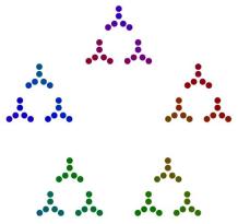
Think fast! How many dots are there in this picture?
This beautiful picture comes to you from Brent Yorgey and Stephen Von Worley. If you counted the dots, you probably didn’t count them one at a time. (And, if you did, can you think of another way to count them?) If you counted them like I did, you noticed that the dots are arranged in rings of five. Then maybe you noticed that the rings of five are themselves arranged in rings of five. And then, finally, you may have noticed that those rings are also arranged in rings of five! How many dots is that? 5x5x5 = 125!
In this blog post, Brent describes how he wrote the computer program that creates these pictures. The program factors numbers into primes. Then, starting with the smallest prime factor, the program arranges dots into regular polygons of the appropriate size with dots (or polygons of dots) at the vertices of the polygon.
Here’s how that works for 90. 90’s prime factorization is 2x3x3x5:
As Brent writes in his post, this counting gets much harder to do with numbers that have large prime factors. For example, here is 183:
 From this picture, I can tell that 183 has 3 as a prime factor. But how many times does 3 go into 183? It isn’t immediately clear.
When Stephen saw Brent’s creation, he decided the diagrams would be even more awesome if they danced. And so he created what he calls the Factor Conga. If you only click on one link today, click that one. The Factor Conga is beautiful and totally mesmerizing.
For more factor diagrams, check out this post from the Aperiodical. There’s a link to the factor diagram by Jason Davies that we posted about over the summer.
 Next up, a few months ago we posted about the puzzles of Sam Loyd – one of which was a puzzle called Get Off the Earth. In this puzzle, the Earth spins and – impossibly – one of the men seems to vanish. This puzzle is a type of illusion called a geometrical vanish. In a geometrical vanish, an image is chopped into pieces and the pieces are rearranged to make a new image that takes up the same amount of space as the original, but is missing something.
Here’s a video of another geometrical vanish:
No matter the picture, these illusions are baffling for the same reason. Rearranging the pieces of an image shouldn’t change the image’s area. And, yet, in these illusions, that’s exactly what seems to happen.
Check out some of these other links to geometrical vanishes. Print out your own here. And think about this: Are these illusions math – and, if it so, how? I came across geometrical vanishes because a friend asked if I thought the Get Off the Earth puzzle was mathematical. He isn’t convinced. If you have any ideas that you think can convince him either way, leave them in the comments section!
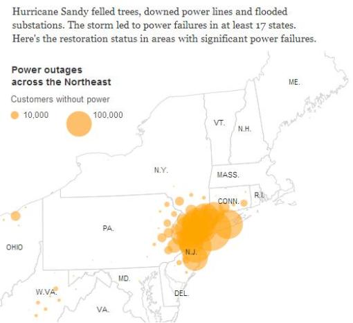
Finally, the Math Munch team’s home, New York City, (and this writer’s other home, New Jersey) was hit by a hurricane this week. The city and surrounding areas are still recovering from the storm. Sandy left millions of people without power and many without homes. One way people have tried to communicate the magnitude of what happened is to make infographics of the data. Making a good infographic requires a blend of mathematics, art, and persuasion. Here some of the most interesting infographics about the storm that I’ve found. Check out how they use size, placement, and color to communicate information and make comparisons.

This infographic from the New York Times shows the number of power outages in the northeast and their locations in different states. The size of the circle indicates the number of people without power. Why would the makers of this infographic choose circles? Why do you think they chose to place them on a map? What do you think of the overlapping?

This is part of an infographic from the Huffington Post that compares hurricanes Sandy and Katrina. Click on the image to see the rest of the infographic. What conclusions can you draw about the hurricanes from the information?

This is a wind map of the country captured at 10:30 in the morning on October 30th, the day hurricane Sandy hit. The infographic was made by scientist-artists Fernanda Viegas and Martin Wattenberg. It shows how wind is flowing around the United States in real-time. Check out their site (click on this image) to see what the wind is doing right now in your part of the country!
To those in places affected by Hurricane Sandy, be safe. To all our readers, bon appetit!


