Tag Archives: graphs

Fractions, Sam Loyd, and a MArTH Journal

Welcome to this week’s Math Munch!

Check out this awesome graph:

What is it?  It’s a graph of the Farey Fractions, with the denominator of the (simplified) fraction on the vertical axis and the value of the fraction on the horizontal axis, made by mathematician and professor at Wheelock College Debra K. Borkovitz (previously).  Now, I’d never heard of Farey Fractions before I saw this image – but the graph was so cool that I wanted to learn all about them!

So, what are Farey Fractions, you ask?  Debra writes all about them and the cool visual patterns they make in this post.  To make a list of Farey Fractions you first pick a number – say, 5.  Then, you list all of the fractions between 0 and 1 whose denominators are less than or equal to the number you picked.  So, as Debra writes in her post, for 5 the list of Farey Fractions is:

As Debra writes, there are so many interesting patterns in Farey Fractions – many of which become much easier to see (literally) when you make a visualization of them.  Debra has made several awesome applets using the program GeoGebra, which she links to in her post.  (You can download GeoGebra and make applets of your own by visiting our Free Math Software page.)  These applets really show the power of using graphs and pictures to learn more about numbers.  To play with the applet that made the picture above, click here.  Check out her post to play with another applet, and to read more about the interesting patterns in Farey Fractions.

Next, check out this website devoted to the puzzles of puzzlemaster Sam Loyd.  Sam Loyd was a competitive chess player and professional puzzle-writer who lived at the end of the nineteenth century.  He wrote many puzzles that are still famous today – like the baffling Get Off the Earth puzzle.  Click the link to play an interactive version of the Get Off the Earth puzzle.

The site has links to numerous Sam Loyd puzzles.  Check out the Picture Puzzles, in which you have to figure out what object is described by the picture, or the Puzzleland Puzzles, which feature characters from the fictional place Puzzleland that Sam created.
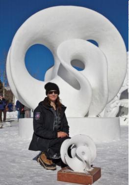
Snow MArTH, made by MArTHist Eva Hild and others at a snow sculpture event in Colorado. From the Spring, 2011 Hyperseeing.

Finally, take a look at some of the beautiful pictures and fascinating articles in this journal about mathematical art (a.k.a., MArTH) called Hyperseeing.  Hyperseeing is edited by mathematicians and artists Nat Friedman and Ergun Akleman.  Hyperseeing is published by the International Society of the Arts, Mathematics, and Architecture, which Nat founded to encourage education connecting the arts, architecture, and math – which we here at Math Munch love!  In one of his articles, Nat defines hyperseeing as, “Interdisciplinary education… concerned with seeing from multiple viewpoints in a very general sense.  Hyperseeing is a more complete way of seeing.”

There are so many beautiful images to look at and interesting articles to read in Hyperseeing.  Among other things, each edition of Hyperseeing features a mathematical comic by Ergun.  Here are some of my favorite Hyperseeings from the archives:

This edition of Hyperseeing features art made from Latin Squares and “organic geometry” art, among many other things.

This edition of Hyperseeing features crocheted hyperbolic surfaces (which we featured not long ago in this Math Munch!) and sculptures made with a 3-D printer, among many other things.

This is the first edition of Hyperseeing. In it, Nat describes the mission of Hyperseeing and the International Society of the Arts, Mathematics, and Architecture.

Bon appetit!

P.S. – You may have noticed a new thing to click off to the right, below the Favorite Munches.  This is our For Teachers section.  The Math Munch team has put together several pages to describe how we use Math Munch in our classes and give suggestions for how you might use it, too.  Teachers and non-teachers alike may want to check out our new Why Math Munch? page, which gives our mission statement.

P.P.S. – The Math Munch team is going to Bridges on Thursday!  Maybe we’ll see you there.

Squiggles, Spheres, and Taxes

Welcome to this week’s Math Munch!

Check out this cool doodle animation from the blog of Matt Henderson. Matt studied math at Cambridge as an undergrad and now does research on speech and language technology. His idea for a doodle was to start with an equilateral triangle and then encircle it with squiggles until it eventually turned into a square.

Matt Henderson

Matt Henderson

Matt’s triangle-to-square squiggle

Matt has all kinds of beautiful and intricate mathematical images on his blog, many of them animated using computer code. He made a similar squiggle-doodle that evolves a straight line into a profile of his face; an animation of rolling a ball on a merry-go-round; a million dot generator; and many more!

Along the same “lines” as Matt’s squiggle, Ted Theodosopoulos wrote an article in Peer Points reviewing a research paper by Stanford mathematician Ravi Vakil. The title of Ravi’s paper is “The Mathematics of Doodling.”

Ravi’s doodle

Next up, check out this cool visualization of a sphere.

The title of the video is Spherikal and was created by Ion Lucin, a graphic artist in Spain.

Something neat comes out about Ion’s attitude toward learning and sharing in a comment he makes:

“Thanks for appreciating my work. I was thinking the same, not to reveal my secrets, but then, i to learned from the videos and tutorials of others, i have been working with 3D for a year and a half, and all i know about it i learned it by myself, by seeing tutorials, im from fine arts. In a way a feel i must share , like other did and helped me”

What a great attitude!

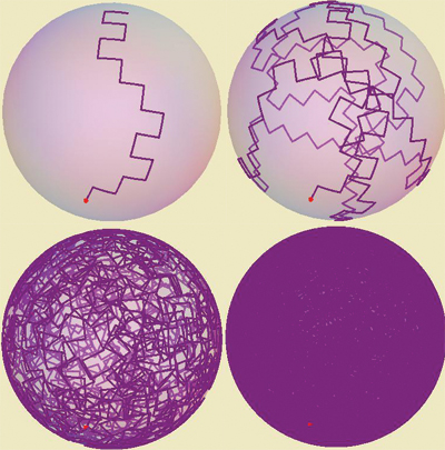
Another spherical idea comes from a post on one of my favorite websites: MathOverflow, a question-and-answer site for research-level mathematicians…and anyone else! The question I have in mind was posted by Joe O’Rourke, a mathematician at Smith College and one of my favorite posters on MathOverflow. It’s about a certain kind of random walk on a sphere. Check it out!

For this step distance, it looks like a random walk will fill up the whole sphere. What about other step distances?

Again, such a cool picture is created by translating a mathematical scenario into some computer code!

Since this week is when federal income taxes are due, I’ll leave you with a few links about taxes and the federal budget. First, here’s the IRS’s website for kids. (Yes, for real.)

Next, this infographic lets you examine how President Obama’s 2011 budget proposal divvied up funds to all of the different departments and projects of the federal government. Can you find NASA’s budget?

2011budget

On a more personal scale, this applet called “Where did my tax dollars go?” does just that—when you give it a yearly personal income, it will calculate how much of it will go toward different ends.

Finally, this applet lets you tinker with the existing tax brackets and see the effect on total revenue generated for the federal government. Can you find a flat tax rate that would keep total tax revenue the same?

Whew! That was a lot; I hope you didn’t find it too taxing. Bon appetit!

Noodles, Flowsnake, and Symmetry

Welcome to this week’s Math Munch!

Gemelli, by Sander Huisman

Gemelli, by Sander Huisman

How much do you like pasta?  Well, these mathematicians and scientists from around the world like pasta so much that they’ve been studying its shape mathematically!  Check out this New York Times article about Sander Huisman, a graduate student in physics from the Netherlands, and Marco Guarnieri and George L. Legendre, two architects from London, who have all taken up making graphs of and equations for pasta shapes.  Sander posts his pasta-graphs on his blog.  Legendre wrote this book about math and pasta, called Pasta By Design.  Legendre has even invented a new type of pasta, shaped like a Mobius strip (see last week’s Math Munch for lots of cool things with Mobius strips), which he named after his baby daughter, Ioli!

Some of Legendre’s pasta plots

Next, here comes the flowsnake.  Wait – don’t run away!  The flowsnake is not a terrifying monster, despite it’s ominous name.  It is a space-filing curve, meaning that the complete curve covers every single point in a part of two-dimensional space.  So if you were to try to draw a flowsnake on a piece of paper, you wouldn’t be able to see any white when you were done.  It’s named flowsnake because it resembles a snowflake.

The flowsnake curve

A single piece of the flowsnake curve.

Units of flowsnake fit together like puzzle pieces to fill the plane

Finally, check out this awesome online symmetry-sketcher, called Symmetry Artist!  Here, you can make doodles of all kinds and then choose how you want to reflect and rotate them.  Fun!

Bon appetit!