Recently I’ve been running across tons of neat, slick math applets. I feel like they all go together. What do they have in common? Maybe you’ll be able to tell me.
Ready for some more? Because with these sorts of visualizations, Dan Anderson has been on fire lately. Dan is a high school math teacher in New York state. He and his students had fifteen minutes of fame last year when they investigated whether or not Double Stuf Oreos really have double the stuf.
Here is Dan’s page on OpenProcessing. (Processing is the computer language in which Dan programs his applets.) And check out the images and gifs on Dan’s Tumblr. Here’s a sampling!
That’s a chunk of math to chew on already, but we’re just getting started! Next up, check out the space-filling artwork of John Shier.
John’s artwork places onto the canvas shapes of smaller and smaller sizes. Notice that the circles below fill in gaps, but they don’t touch each other, they way circles do in an Apollonian gasket.
You can learn more about John’s space-filling shapes on this page and find further details in this paper.
Thanks for making us this sweet banner, John!
Last up this week, head to this site to watch an awesome trailer of a film about Julia Robinson. The short clip focuses on Julia’s work on Hilbert’s tenth problem. It includes interviews with a number of people who knew Julia, including her sister Constance Reid. Constance wrote extensively about mathematics and mathematicians. I’ve read her biography of Hilbert and can highly recommend it. You can read more about Julia and Constance here and here.
Julia Robinson
Julia’s sister, Constance Reid
Julia and Constance as young girls.
You might enjoy visiting the site of the Julia Robinson Mathematics Festival. Check to see if a festival will be hosted in your area sometime soon, or find out how you can run one yourself!
With May wrapped up and June getting started, I hope you have a lot of math to look forward to this summer. Bon appetit!
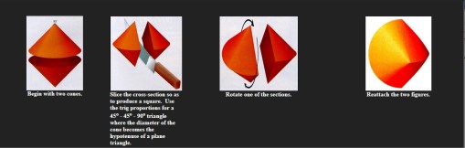
What is that? Well, it rolls like a sphere, but is made of two cones attached with a twist– hence, the spheri-con! The one in the video is made out of pie (not sure why…), but you can make sphericons out of all kinds of materials.
It was developed by a few people at different times– like many brilliant new objects. But it entered the world of math when mathematician Ian Stewart wrote about it in his column in Scientific American. The wooden sphericon was made by Steve Mathias, an engineer from Sacramento, California, who read Ian’s article and thought sphericons would be fun to make. To learn more about how Steve made those beautiful wooden sphericons, check out his site!
Even if you’re not a woodworker, like Steve, you can still make your own sphericon. You can start with two cones and make one this way, by attaching the cones at their bases, slicing the whole thing in half, rotating one of the halves 90 degrees, and attaching again:
Or you can print out this image, cut it out, fold it up, and glue (click on the image for a larger printable size):
If you do make your own sphericon (which I recommend, because they’re really cool), watch the path it makes as it rolls. See how it wiggles? What shape do you think the path is?
I found out about the sphericon while browsing through an awesome website– the National Curve Bank. It’s just what it sounds like– an online bank full of curves! You can even make a deposit– though, unlike a real bank, you can take out as many curves as you like. The goal of the National Curve Bank is to provide great pictures and animations of curves that you’d never find in a normal math book. Think of how hard it would be to understand how a sphericon works if you couldn’t watch a video of it rolling?
There are lots of great animations of curves and other shapes in the National Curve Bank– like the sphericon! Another of my favorites is the “cycloid family.” A cycloid is the curve traced by a point on a circle as the circle rolls– like if you attached a pen to the wheel of your bike and rode it next to a wall, so that the pen drew on the wall. It’s a pretty cool curve– but there are lots of other related curves that are even cooler. The epicycloid (image on the right) is the curve made by the pen on your bike wheel if you rode the bike around a circle. Nice!
You should explore the National Curve Bank yourself, and find your own favorite curve! Let us know in the comments if you find one you like.
String art cardioid
Finally, to round out this week’s post on circle-y curves (pun intended), check out another of my favorite curves– the cardioid. A cardioid looks like a heart (hence the name). There are lots of ways to make a cardioid (some of which we posted about for Valentine’s Day a few years ago). But my favorite way is to make it out of string!
String art is really fun. If you’ve never done any string art, check out the images made by Julia Dweck’s class that we posted last year. Or, try making your own string art cardioid! This site shows you how to draw circles, ovals, cardioids, and spirals using just straight lines– you could follow the same instructions, replacing the straight lines you’d draw with pieces of string attached to tacks! If you’re not sure how the string part would work, check out this site for basic string art instructions.
The most epic Pi Day of the century will happen in just a few weeks: 3/14/15! I hope you’re getting ready. To help you get into the spirit, check out these quilts.
American Pi.
African American Pi.
There’s an old joke that “pi is round, not square”—a punchline to the formula for the area of a circle. But in these quilts, we can see that pi really can be square! Each quilt shows the digits of pi in base 3. The quilts are a part of a project called SquareRoots by artist and mathematician John Sims.
John Sims.
There’s lots more to explore and enjoy on John’s website, including a musical interpretation of pi and some fractal trees that he has designed. John studied mathematics as an undergrad at Antioch College and has pursued graduate work at Wesleyan University. He even created a visual math course for artists when he taught at the Ringling College of Art and Design in Florida.
I enjoyed reading several articles (1, 2, 3, 4) about John and his quilts, as well as this interview with John. Here’s one of my favorite quotes from it, in response to “How do you begin a project?”
It can happen in two ways. I usually start with an object, which motivates an idea. That idea connects to other objects and so on, and, at some point, there is a convergence where idea meets form. Or sometimes I am fascinated by an object. Then I will seek to abstract the object into different spatial dimensions.
Cellular Forest and Square Root of a Tree, by John Sims.
You can find more of John’s work on his YouTube channel. Check out this video, which features some of John’s music and an art exhibit he curated called Rhythm of Structure.
Next up: Some of our US states are nice and boxy—like Colorado. (Or is it?) Other states have very complicated, very dent-y shapes—way more complicated than the shapes we’re used to seeing in math class.
Which state is the most dent-y? How would you decide?
West Virginia is pretty dent-y. By driving “across” it, you can pass through many other states along the way.
The mathematical term for dent-y is “concave”. One way you might try to measure the concavity of a state is to see how far outside of the state you can get by moving in a straight line from one point in it to another. For example, you can drive straight from one place in West Virginia to another, and along the way pass through four other states. That’s pretty crazy.
But is it craziest? Is another state even more concave? That’s what this study set out to investigate. Click through to find out their results. And remember that this is just one way to measure how concave a state is. A different way of measuring might give a different answer.
Awesome animal kingdom gerrymandering video!
This puzzle about the concavity of states is silly and fun, but there’s more here, too. Thinking about the denty-ness of geographic regions is very important to our democracy. After all, someone has to decide where to draw the lines. When regions and districts are carved out in a way that’s unfair to the voters and their interests, that’s called gerrymandering.
Karen Saxe.
To find out more about the process of creating congressional districts, you can listen to a talk by Karen Saxe, a math professor at Macalester College. Karen was a part of a committee that worked to draw new congressional districts in Minnesota after the 2010 US Census. (Karen speaks about compactness measures starting here.)
Recently I ran across an announcement for a conference—a conference that was all about the math of sea ice! I never grow tired of learning new and exciting ways that math connects with the world. Check out this video featuring Kenneth Golden, a leading mathematician in the study of sea ice who works at the University of Utah. I love the line from the video: “People don’t usually think about mathematics as a daring occupation.” Ken and his team show that math can take you anywhere that you can imagine.


 You can learn more about John’s space-filling shapes on this page and find further details in this paper.