Up first, are you enjoying the technology you’re reading this on? Well you can thank Ada Lovelace for that. She’s the 19th century mathematician that worked on the first computing machines with Charles Babbage and is often called “the first computer scientist.” There’s no better day to thank her than today, since it’s Ada’s 197th birthday. Justin found a great little comic dramatizing her life and work. It’s called “2D Goggles or The Thrilling Adventures of Lovelace and Babbage.” It’s also available as a free iPad app called Lovelace & Babbage, in case you have one of those.
Ada Lovelace hard at work in comic book form
Bertrand Russell from Logicomix
I can also recommend one other math comic. It’s a graphic novel called Logicomix: An Epic Search for Truth detailing the life and research of English logician Bertrand Russell, a personal hero of mine. You can buy it here.
Up next, I found a nice little web resource lately called A+ Click. It’s basically just a collection of math tests, but they have them for every level, and the problems are actually pretty great. Give it a try, and don’t feel like you have to stick to your grade. There’s bound to be tough ones and easier ones in every set. You can actually learn a lot by working on new kinds of problems you’ve never even heard of. You just have to figure out what the words mean, so here’s an illustrated mathematical glossary to help you out, or this maths dictionary for kids. And here’s a sample problem I like:
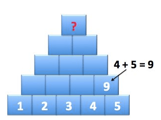
Add the adjacent numbers together and write their sum in the block above them. What is the number at the top of the pyramid?
I wonder if there was a way to predict the answer without filling in all the boxes. And what if the pyramid had 1,2,3,4,5,… all the way up to 10? Hmmmm. Any readers have any ideas? Just leave us a comment.
Finally, Plus Magazine’s website is full of really good math articles and things. For the holiday season, they’ve created a mathematical advent calendar. Each day, a new “door” can be opened which leads to further links and descriptions to neat math content. For example, on the 8th day we had Door #8: Women in Maths, including information about Ada Lovelace!
And here’s a little bonus video for you this week. For their recent music video, Lost Lander decided to illustrate the prime numbers as they build up. It’s quite nice, and not a bad song either.
Four million grains of sand dropped onto an infinite grid. The colors represent how many grains are at each vertex. From this gallery.
We got our first snowfall of the year this past week, but my most recent mathematical find makes me think of summertime instead. The picture to the right is of a sandpile—or, more formally, an Abelian sandpile model.
If you pour a bucket of sand into a pile a little at a time, it’ll build up for a while. But if it gets too tall, an avalanche will happen and some of the sand will tumble away from the peak. You can check out an applet that models this kind of sand action here.
A mathematical sandpile formalizes this idea. First, take any graph—a small one, a medium sided one, or an infinite grid. Grains of sand will go at each vertex, but we’ll set a maximum amount that each one can contain—the number of edges that connect to the vertex. (Notice that this is four for every vertex of an infinite square grid). If too many grains end up on a given vertex, then one grain avalanches down each edge to a neighboring vertex. This might be the end of the story, but it’s possible that a chain reaction will occur—that the extra grain at a neighboring vertex might cause it to spill over, and so on. For many more technical details, you might check out this article from the AMS Notices.
This video walks through the steps of a sandpile slowly, and it shows with numbers how many grains are in each spot.
A sandpile I made with Sergei’s applet
You can make some really cool images—both still and animated—by tinkering around with sandpiles. Sergei Maslov, who works at Brookhaven National Laboratory in New York, has a great applet on his website where you can make sandpiles of your own.
David Perkinson, a professor at Reed College, maintains a whole website about sandpiles. It contains a gallery of sandpile images and a more advanced sandpile applet.
Hexplode is a game based on sandpiles.
I have a feeling that you might also enjoy playing the sandpile-inspired game Hexplode!
Next up: we’ve shared links about Fibonnaci numbers and prime numbers before—they’re some of our favorite numbers! Here’s an amazing fact that I just found out this week. Some Fibonnaci numbers are prime—like 3, 5, and 13—but no one knows if there are infinitely many Fibonnaci primes, or only finitely many.
A great place to find out more amazing and fun facts like this one is at The Prime Pages. It has a list of the largest known prime numbers, as well as information about the continuing search for bigger ones—and how you can help out! It also has a short list of open questions about prime numbers, including Goldbach’s conjecture.
Be sure to peek at the “Prime Curios” page. It contains intriguing facts about prime numbers both large and small. For instance, did you know that 773 is both the only three-digit iccanobiF prime and the largest three-digit unholey prime? I sure didn’t.
Last but not least, I ran across this article about how a software company has come up with a new solution for mixing colors on a computer screen by using six dimensions rather than the usual three.
Dimensions of colors, you ask?
The arithmetic of colors!
Well, there are actually several ways that computers store colors. Each of them encodes colors using three numbers. For instance, one method builds colors by giving one number each to the primary colors yellow, red, and blue. Another systems assigns a number to each of hue, saturation, and brightness. More on these systems here. In any of these systems, you can picture a given color as sitting within a three-dimensional color cube, based on its three numbers.
A color cube, based on the RGB (red, green, blue) system.
If you numerically average two colors in these systems, you don’t actually end up with the color that you’d get by mixing paint of those two colors. Now, both scientists and artists think about combining colors in two ways—combining colored lights and combining colored pigments, or paints. These are called additive and subtractive color models—more on that here. The breakthrough that the folks at the software company FiftyThree made was to assign six numbers to each color—that is, to use both additive and subtractive ideas at the same time. The six numbers assigned to a given number can be thought of as plotting a point in a six-dimensional space—or inside of a hyper-hyper-hypercube.
I think it’s amazing that using math in this creative way helps to solve a nagging artistic problem. To get a feel for why mixing colors using the usual three-coordinate system is such a problem, you might try your hand at this color matching game. For even more info about the math of color, there’s some interesting stuff on this webpage.
Think fast! How many dots are there in this picture?
This beautiful picture comes to you from Brent Yorgey and Stephen Von Worley. If you counted the dots, you probably didn’t count them one at a time. (And, if you did, can you think of another way to count them?) If you counted them like I did, you noticed that the dots are arranged in rings of five. Then maybe you noticed that the rings of five are themselves arranged in rings of five. And then, finally, you may have noticed that those rings are also arranged in rings of five! How many dots is that? 5x5x5 = 125!
In this blog post, Brent describes how he wrote the computer program that creates these pictures. The program factors numbers into primes. Then, starting with the smallest prime factor, the program arranges dots into regular polygons of the appropriate size with dots (or polygons of dots) at the vertices of the polygon.
Here’s how that works for 90. 90’s prime factorization is 2x3x3x5:
As Brent writes in his post, this counting gets much harder to do with numbers that have large prime factors. For example, here is 183:
From this picture, I can tell that 183 has 3 as a prime factor. But how many times does 3 go into 183? It isn’t immediately clear.
When Stephen saw Brent’s creation, he decided the diagrams would be even more awesome if they danced. And so he created what he calls the Factor Conga. If you only click on one link today, click that one. The Factor Conga is beautiful and totally mesmerizing.
For more factor diagrams, check out this post from the Aperiodical. There’s a link to the factor diagram by Jason Davies that we posted about over the summer.
Next up, a few months ago we posted about the puzzles of Sam Loyd – one of which was a puzzle called Get Off the Earth. In this puzzle, the Earth spins and – impossibly – one of the men seems to vanish. This puzzle is a type of illusion called a geometrical vanish. In a geometrical vanish, an image is chopped into pieces and the pieces are rearranged to make a new image that takes up the same amount of space as the original, but is missing something.
Here’s a video of another geometrical vanish:
No matter the picture, these illusions are baffling for the same reason. Rearranging the pieces of an image shouldn’t change the image’s area. And, yet, in these illusions, that’s exactly what seems to happen.
Check out some of these otherlinks to geometrical vanishes. Print out your own here. And think about this: Are these illusions math – and, if it so, how? I came across geometrical vanishes because a friend asked if I thought the Get Off the Earth puzzle was mathematical. He isn’t convinced. If you have any ideas that you think can convince him either way, leave them in the comments section!
Finally, the Math Munch team’s home, New York City, (and this writer’s other home, New Jersey) was hit by a hurricane this week. The city and surrounding areas are still recovering from the storm. Sandy left millions of people without power and many without homes. One way people have tried to communicate the magnitude of what happened is to make infographics of the data. Making a good infographic requires a blend of mathematics, art, and persuasion. Here some of the most interesting infographics about the storm that I’ve found. Check out how they use size, placement, and color to communicate information and make comparisons.
This infographic from the New York Times shows the number of power outages in the northeast and their locations in different states. The size of the circle indicates the number of people without power. Why would the makers of this infographic choose circles? Why do you think they chose to place them on a map? What do you think of the overlapping?
This is part of an infographic from the Huffington Post that compares hurricanes Sandy and Katrina. Click on the image to see the rest of the infographic. What conclusions can you draw about the hurricanes from the information?
This is a wind map of the country captured at 10:30 in the morning on October 30th, the day hurricane Sandy hit. The infographic was made by scientist-artists Fernanda Viegas and Martin Wattenberg. It shows how wind is flowing around the United States in real-time. Check out their site (click on this image) to see what the wind is doing right now in your part of the country!
To those in places affected by Hurricane Sandy, be safe. To all our readers, bon appetit!